Web-based HMI for REXYGEN
User guide
2024-03-01
Plzeň (Pilsen), Czech Republic
Contents
2 WebWatch
2.1 Automatic Generation of HMI from REXYGEN Studio
2.2 Advanced Usage
3 REXYGEN HMI Designer
3.1 A Graphical Designer of Web HMI
3.2 General configuration of the HMI
3.2.1 Connections tab
3.2.2 Options tab
3.2.3 HTML Export tab
3.3 REXYGEN HMI Designer extensions
3.3.1 Group animation
3.3.2 Update Components
3.4 List of available components
3.4.1 HMIConfig
3.4.2 CHARTS
3.4.3 GENERAL
3.4.4 HOME
3.4.5 PROC
4 WebBuDi
4.1 Simple Buttons and Displays on the Web
4.2 Available Rows and Components
4.2.1 AnalogLookupTable
4.2.2 AnalogReadRow
4.2.3 AnalogWriteRow
4.2.4 DigitalReadRow
4.2.5 DigitalWriteRow
4.2.6 EmptySpace
4.2.7 LinkButton
4.2.8 ManualPulseRow
4.2.9 PushButton
5 REX.HMI library
5.1 How to Use the Library
5.2 Reference Guide for REX.HMI
5.3 Reference Guide for REX.HMI.Graph
Chapter 1
Introduction
RexHMI covers all tools and libraries necessary for creating human-machine interfaces (visualizations) for the REXYGEN system. There are three different types of visualization the WebWatch, the WebBuDi and the one created by REXYGEN HMI Designer.
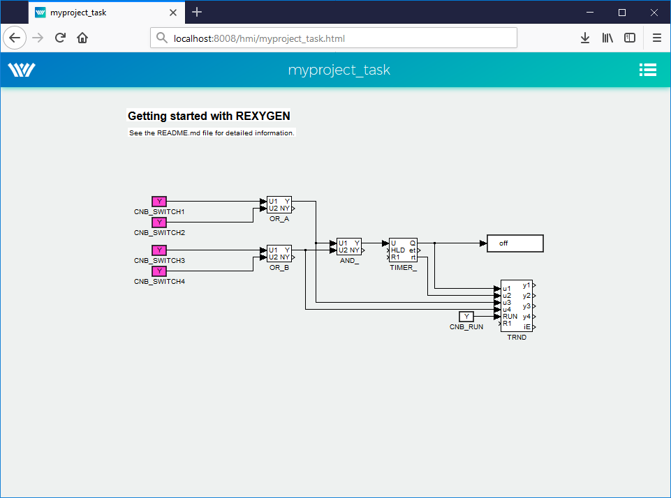
- WebWatch(Chapter 2) is an auto-generated HMI from the REXYGEN Studio development tool during project compilation. It has similar look, attributes and functions as the Watch mode of the REXYGEN Studio development tool. The WebWatch is a perfect tool for instant creation of HMI that is suitable for system developers or integrators. It provides a graphical interaction with almost all signals in the control algorithm.
- REXYGEN HMI Designer(Chapter 3) creates a standard SVG file with the RexHMI extensions. The REXYGEN HMI Designer is a great tool for creating graphical HMI that is suitable for operators and other end users.
- WebBuDi(Chapter 4), which is an acronym for Web Buttons and Displays, is a simple JavaScript file with several declarative blocks that describe data points which the HMI is connected to and assemble a table in which all the data is presented. It provides a textual interaction with selected signals and is suitable for system developers and integrators or may serve as a fall-back mode HMI for non-standard situations.
All the tools result to the HTML5 web page served from the internal REXYGEN web server. The HMI can be accessed using desktop, tablets and also mobile devices. Recommended web browsers are Google Chrome and Mozilla Firefox. The HMI is based on HTML5, CSS3, JavaScript and WebSockets.
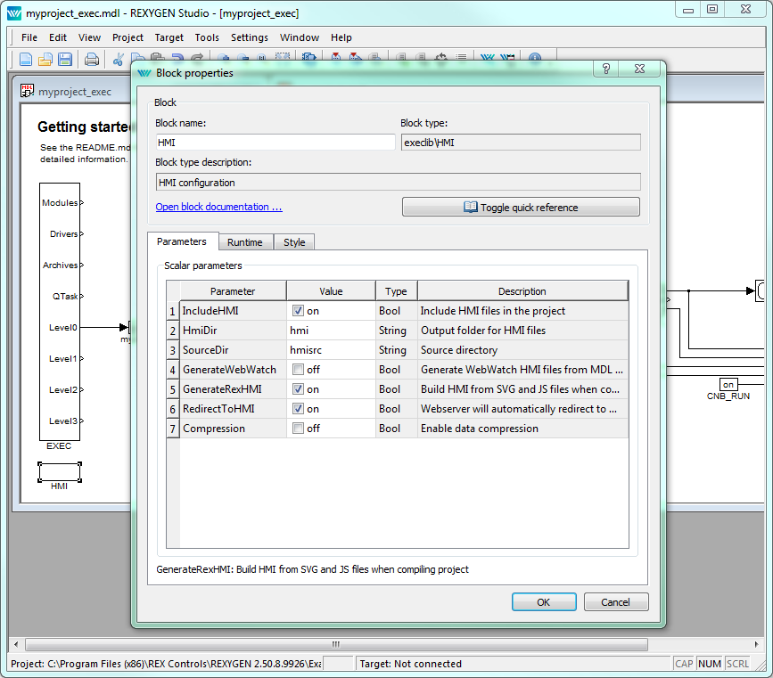
Usually the HMI is downloaded to the target device using HMI block in the exec.mdl file. In the project directory create exec.mdl file (or use predefined templates from the Start-up wizard). Add the HMI block to the executive, set the IncludeHMI parameter and then enable WebWatch visualization (GenerateWebWatch parameter) or create your custom one. Once configured the visualization is downloaded using Compile and Download function in the REXYGEN Studio design tool to the target device. The HMI is accessible from the internal server of the target device for example at http://192.168.1.100:8008/hmi.
The URL can include additional parameters to influence the behaviour of the HMI:
- virtualKeyboard - Activating virtual keyboard on devices with a touchscreen. Used typically on panel PCs powered by Linux, where the operating system does not provide such a feature natively.
- noLogout - Hiding the Logout link. Typically used in devices operating in kiosk mode.
Example: http://192.168.1.100:8008/hmi/index.html?virtualKeyboard=true&noLogout=true
For the special cases user can create its own HMI based on the JavaScript and custom HTML or SVG components. For that purpose the REX.HMI function library is available. Chapter 5 describes all functions with parameters.
Chapter 2
WebWatch
2.1 Automatic Generation of HMI from REXYGEN Studio
WebWatch is automatically generated HMI based on the project structure. It is similar to the Watch mode in REXYGEN Studio. The whole scheme is generated to web page. User can monitor all signals from selected blocks, change block parameters and read the data from TRND blocks. The WebWatch is generated automatically using HMI block in project main file.
- Insert HMI block to the exec.mdl file of your project.
- Check GenerateWebWatch and IncludeHMI to enable WebWatch generation.
- Run Compile and Download.
- Open the web browser and navigate to your target device eg. http://192.168.1.100:8008/hmi.
- Use left mouse click (touch) for changing the block parameters and right mouse click (long touch) for enabling the block monitoring.
2.2 Advanced Usage
The auto-generated scheme can be adjusted manually. (Note: If the GenerateWebWatch in HMI block is enabled the HMI is generated whenever the scheme is compiled. So for manual adjustment disable the GenerateWebWatch option in HMI block.)
Edit the REX.HMI.init = function(){} function in the selected *.html file. There are only few functions for the WebWatch HMI, but you can use all the functions described in chapter 5.
REX.WebWatch.enableMonitoring(blockIDs)
– Enable monitoring of the selected blocks from the beginning (after web page is
loaded).
|
Param |
Type |
Description |
|
|
||
|
blockIDs |
Array .<String> |
List of all blocks, described by connection string (eg.[“task.block1”,“task.block2”]) |
|
|
||
|
|
||
|
|
||
Example
2REX.HMI.init = function(){
3 REX.WebWatch.enableMonitoring(["pidcontrol_control.CNR_sp","pidcontrol_control.PIDU"]);
4}
REX.WebWatch.disableHint() – Disable hint after page is loaded
REX.WebWatch.showHint() – Show hint
Chapter 3
REXYGEN HMI Designer
3.1 A Graphical Designer of Web HMI
REXYGEN HMI Designer (The REXYGEN HMI Designer is build on the well-known SVG editor InkscapeTM https://inkscape.org/en/.) is tool for designing the custom visualizations using predefined components. The whole HMI is stored in the SVG (Scalable Vector Graphics) file with REXYGEN specific extensions.
When the visualization is ready the HTML page with all necessary libraries is generated. Such a webpage can be easily generated and downloaded to the target device from ./hmi directory using Compile and Download function of the REXYGEN Studio development tool.
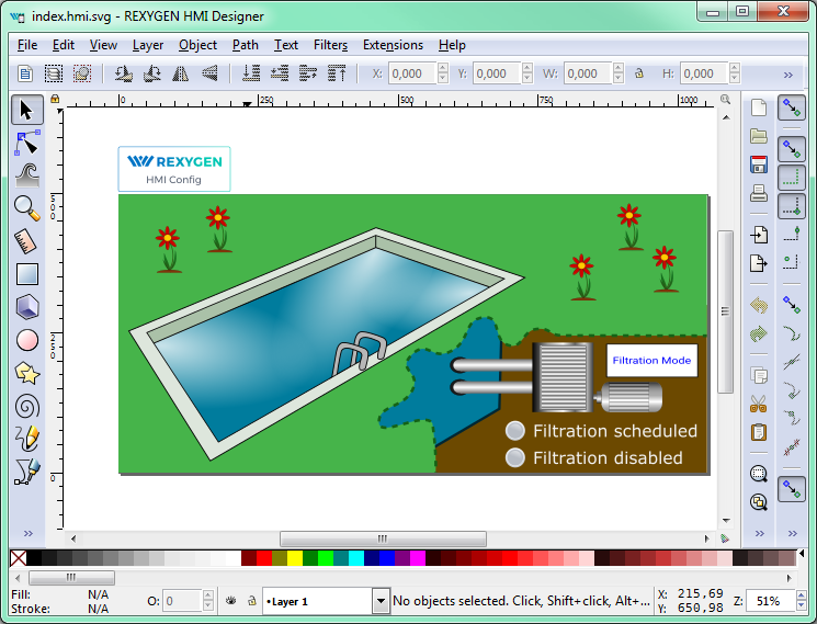
Each HMI scheme composes from several components which are connected to the signals from the control system. These components are organized in libraries. The example HMI on fig. 3.1 contain one Button, two LEDs and several GeneralComponents for pool and flower animations.
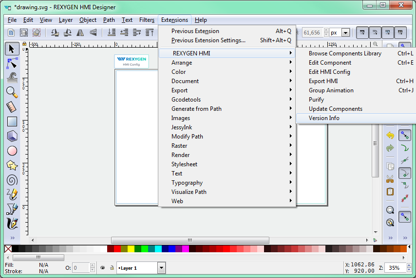
The HMI components are controlled via extensions (on fig. 3.2) which edit the REXYGEN HMI specific parameters and allow the export of the final HMI. There are following extensions:
- Browse Components Library (Ctrl + L) – Open the folder with all available components. Each component is stored as a SVG file which can be drag&dropped to the current HMI
- Edit Component (Ctrl + E) – Open edit window for the selected component or for the whole project if nothing is selected.
- Edit HMI Config – Open edit window for the general HMI configuration.
- Export HMI (Ctrl + H) – Exports the content of the SVG file to the HTML5 webpage with all necessary libraries. This extension is configured via parameters of the whole project.
- Group Animation (Ctrl + J) – Enable animation of the transformations (translation, rotation, scale), opacity or color of the selected object (SVG group) based on the values from the control system. Or you can use the extension to create clickable button.
- Purify – Finds all invalid component in the document a removes them. The component is invalid either if does not contain any valid JSON configuration or visible content like rectangles, texts, etc.
- Update Components – Extension for updating the schema to new version
- Version Info – Show current version of the REXYGEN HMI Designer and HMI tools.
3.2 General configuration of the HMI
Every custom visualization created using REXYGEN HMI Designer must contain general configuration which is stored in the HMI Config element. The element is added automatically with new document or after first use of Edit Component extension. The general configuration consists of three sections
- Connections - The list of connections between the HMI and REXYGEN.
- Options - General options for the HMI. See the subsection 3.4.1 for all available options.
- HMTL export - Configuration of the HTML export.
3.2.1 Connections tab
The connection tab contains table maps between an Alias (the name of the data point in HMI) and connection string (the path where the value is read or written form the REXYGEN). Each connection can have one of two types:
- R – Read item, the values are read from the target,
- W – Write item, the value can be written to the target after change.
There are two more special types the
- L – Local item,
- X – Expression item (will be described later).
When the HMI Config is opened the Aliases of the data points used in the HMI components are loaded automatically. Also the R or W type is selected based on the type of the component (e.g. The Button value data point will point to the W rite connection, but Led value will point to the Read one). For these connections just use the browse function to fill the connection string.
Press Browse button. The login dialog will be opened. Unless you changed the login credentials, use the default username admin with an empty password. After a successful login the connection tab is expanded with a tree-view of the running algorithm. Select Connection String field of the selected Alias and afterwards browse the tree to the desired block and double-click the parameter. The connection string of the parameter is copied to the alias. Follow this procedure to fill all the R and W connections. For basic example see [1].
The Local connection type (L) represents a variable. User can define custom item which can be read or written using standard HMI components. The default value is set using Connection string field. The Local item is available only for current webpage. So if you refresh the webpage or open new one in different tab the default value is loaded.
The Expression connection type (X) is used for evaluation expression above other aliases. The alias is read only and updates whenever any of the selected items change. The alias name used in the expression is surrounded by curly brackets. For example:
The available operations are:
- Arithmetic – +, -, *, /, %
- Bitwise – not (~), and (&), or (|), xor (^|)
- Shift – left (<<), right (>>), right logical (>>>)
- Logical – not, and, or, xor
- Relations – ==, !=, <, >, <=, >=
- Constants – pi, e, true, false, null
The expression can point to item type. It can contain constants such as numbers or strings. The type of value is set based on the type of value from used connection. If the expression cannot be evaluated, you will se error log message in the HMI webpage. You can also use expression to concat strings. The example of simple usage of local and expression types is shown in the following figure 3.3.
Note: If expression item points to another expression item the target item MUST be always defined before. The items are sorted alphabetically based on the used Alias so the target item must have proper name.
3.2.2 Options tab
See the subsection 3.4.1 for all available options.
3.2.3 HTML Export tab
There are two levels of the HTML export configuration. Basic level allows user to change title of the webpage and title in header of the webpage. Also it is possible to disable generation of tooltips.
When the Expert mode is activated user can change following advance options:
- Build config file path – For advanced purposes.
- Create viewbox – If selected the SVG document fits into the viewbox of the rendered webpage. The aspect ration is preserved. If the option is unselected the SVG size is not changed so only part of the document can be visible and the scrollbar can be shown.
- User library Path – Each HMI component uses combination of SVG file and javascript
resources. The default libraries are included to the project automatically if the Library
Path table is empty. If not user must select directory paths where resources
for HMI components are located. The path check during HTML export is
following:
- Absolute path – If the path is absolute just use it or show error if not directory.
- Relative path, exclude default libraries is not selected – Check if the string in the library path is not same as Default library name. If so use the default library. If not check if exist and use it otherwise show error.
- Relative path, exclude default libraries is selected – During HTML export check if the directory on the relative path exist otherwise show an error.
3.3 REXYGEN HMI Designer extensions
3.3.1 Group animation
Group animation extension allow to turn SVG group into custom HMI component. At first draw some shape or group several elements together using Ctrl + G shortcut. Then open the Group Animation extension using Ctrl + J. Now there are several choices:
- Translate X – Move selected group in the X direction based on the signal from chosen datapoint.
- Translate Y – Move selected group in the Y direction based on the signal from chosen datapoint.
- Rotate – Rotate selected group around the rotation center selected in the group before the extension was called. The rotation is set from the signal from chosen datapoint.
- Scale – Scale selected in chosen direction based on the signal from chosen datapoint.
- Opacity – Change opacity of the whole group based on the signal from chosen datapoint.
- Change Color – Change fill or stroke color based on the signal from chosen datapoint.
- Turn group into a button – Create custom clickable button which has same parameters and behavior as the Button component.
Note: The group can be either button or have a several group animations.
When all the wanted animations are checked, just press OK to create the custom component. From now on the parameters of the component are now editable using Element Editor extension. If some of the animation is not wanted anymore you can just open the group animation extension again and change your choice.
3.3.2 Update Components
Update Component extension will check all the components in the current file and compare them between the version in the library. If the version is different it will propose the type of the upgrade. We have three types:
- None – Do nothing.
- Partial – Change metadata and copy parameters, do not touch underlying SVG.
- Full – Upgrade whole component SVG and metadata.
The upgrade algorithm will choose the best upgrade option for you.
3.4 List of available components
There are several predefined HMI components in the component library. Every component is represented as one SVG file which can be drag&drop to the current visualization scheme. The library is divided to five main groups:
- GENERAL - Set of common components like buttons, inputs, sliders, gauges for visualization of basic variables.
- HOME - Set of components for home automation, like various pipes, valves, radiators, boilers and more.
- HVAC - Specialized library for heating, ventilation and air conditioning visualizations.
- CHARTS - Specialized library for various charts.
- PROC - Specialized library for process control visualizations.
Every component has some data points which provide the interaction between live data and state of the HMI. Mostly you can find:
- value - the main data point where value is read or written,
- disable_by - the component is disabled when connected to non-zero value,
- hide_by - the component is hidden when connected to non-zero value.
and various options which are described in the following text. The components are sort alphabetically.
3.4.1 HMIConfig
Global REXYGEN HMI configuration component. User can change project options, configure the HTML export and define list of connections between REXYGEN target and HMI.
|
Options |
Type |
Description |
|
refresh_rate |
int |
Changes the default read refresh rate of the whole HMI. Default 500ms |
|
log_level |
enum |
Set the global log level for whole RexHMI. The log messages are written both to the right upper corner menu and to the web browser console. Default level is INFO. |
|
show_clock |
bool |
If True the clock are shown in the right upper corner of the template instead of blinking square. If the target is connected the clock are updated if connection get error o lost the time stops. |
|
use_client_time |
bool |
If True the show_clock display the time from client computer rather then target. This can be use when target device does not have NTP synchronization or RTC chip. |
|
header_mode |
enum |
Change the default size of the header (thin, packed). If packed click on the logo to show the header. |
|
kiosk_mode |
bool |
If True the links from header (from logo and header) are removed and user can not change the refresh rate and target. |
|
target_url |
str |
The URL of the target device. So far only the
WebSocket protocol is supported. The URL must
also contain the PORT, but the protocol can
be omitted. Default is empty string which means
ws://127.0.0.1:8008 |
|
|
||
|
|
||
3.4.2 CHARTS
RadarChart
Radar chart based on the Chart.js library.
|
Data points |
Optional |
Description |
|
values |
|
An array of signals. |
|
hide_by |
True |
If non-zero the component is hidden. |
|
disable_by |
True |
If non-zero the component is disabled and data are no longer updated. |
|
Options |
Type |
Description |
|
chartJsOptions |
object |
Custom options for Chart.js library. See https://www.chartjs.org for more info. |
|
min |
int |
Axis min |
|
max |
int |
Axis max |
|
step |
int |
Angle between two samples [deg] |
|
labelStep |
int |
The number of steps when label will be generated. |
|
|
||
|
|
||
XYChart
XY chart based on the Chart.js library. The signals are read from a TRND(V) block or an array. Each two signals are used as X and Y coordinates for each signal.
|
Data points |
Optional |
Description |
|
values |
|
An array of XY data in columns or link to TRND block. |
|
hide_by |
True |
If non-zero the component is hidden. |
|
disable_by |
True |
If non-zero the component is disabled and data are no longer updated. |
|
reset_by |
True |
If non-zero the data in chart are cleared. |
|
Options |
Type |
Description |
|
title |
str |
Chart title |
|
signals |
table |
Table of signal labels. Write labels in the same order as you connect the signals to the Array or TRND block. |
|
bufferSize |
int |
Applicable only if connected to TRND block. Maximum number of stored samples. If -1 the number of samples is read from TRND block configuration. |
|
hideLegend |
bool |
If true the legend is hidden. |
|
showLines |
bool |
If true the XY points are connected using line. |
|
xAxis |
table |
Table of basic parameters for X axis. Only first row is used! |
|
yAxis |
table |
Table of basic parameters for Y axis. Only first row is used! |
|
chartJsOptions |
object |
Custom options for Chart.js library. See https://www.chartjs.org for more info. |
|
|
||
|
|
||
3.4.3 GENERAL
AlarmsTable
Table component which shows active alarms from the internal REXYGEN alarms subsystem.
|
Options |
Type |
Description |
|
columns |
array |
Define visible columns for the alarm table. The columns are shown according to the order of appearance in the array. |
|
fontScale |
float |
Use this parameter to scale font. |
|
timeFormat |
string |
Date time format of the shown timestamp. See luxon.js for more details. |
|
|
||
|
|
||
BarGraph

Bargraph component which draw scale on the left side and contain color zones and current value display
|
Data points |
Optional |
Description |
|
value |
|
Displayed value |
|
disable_by |
True |
If non-zero the component is disabled. |
|
hide_by |
True |
If non-zero the component is hidden. |
|
Options |
Type |
Description |
|
rangeMin |
float |
Lower limit for the bargraph value |
|
rangeMax |
float |
Upper limit for the bargraph value |
|
tickStep |
float |
Value for small tick step between main tick steps. |
|
mainTickStep |
float |
Value for main axis tick steps |
|
decimals |
float |
How many decimal figures are displayed |
|
units |
str |
Text which is displayed on the bottom of the bargraph. Usually the name of units. |
|
colorZones |
table |
User can define several color zones which can represent some level of warning. The zones are displayed on the right side of the bargraph. Each has a custom color and range defined by startValue and endValue. Just double click the colorZones and change them in table. |
|
colorOffLimits |
color |
The border color of the bargraph when the value is of rangeMin and rangeMax limits. |
|
levelColor1 |
color |
Change the main bargraph gradient color |
|
levelColor2 |
color |
Change the supplementary bargraph gradient color |
|
|
||
|
|
||
Battery
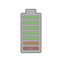
Show battery level from 0 to 100 %.
|
Data points |
Optional |
Description |
|
value |
|
Battery level from 0 to 100 |
|
Options |
Type |
Description |
|
|
||
|
|
||
Button
The Button component changes the boolean value. Normally the ON state means TRUE value
and OFF mean FALSE value. If needed the parameter reverseMeaning switches the written
values.
There are three different modes of operation:
PushButton when press or touched the ON state is written to the target value datapoint.
When released the OFF state is written.
ManualPulse Always write TRUE value after button is pressed, release is ignored (Suitable for
MP block control).
ToggleButton When button is pressed the value is toggled (ON -> OFF -> ON).
|
Data points |
Optional |
Description |
|
value |
|
The main datapoint where boolean value is written. |
|
refresh_from |
True |
If set the state of the component is updated based on the value read from this datapoint. Otherwise the value from main datapoint is used. |
|
disable_by |
True |
If non-zero the component is disabled. |
|
hide_by |
True |
If non-zero the component is hidden. |
|
readonly_by |
True |
If non-zero the component will change once to read-only mode. |
|
Options |
Type |
Description |
|
type |
enum |
Changes the type of the Button. |
|
reverseMeaning |
bool |
If True the meaning of the value is switched. So the ON state is False and OFF state is True. |
|
fontScale |
float |
Use this parameter to scale font because the button is using HTML button component which is not binded with SVG. |
|
labelFalse |
str |
Button label when the state is OFF |
|
labelTrue |
str |
Button label when the state is ON. If not defined the labelFalse is used. |
|
colorFalse |
color |
Button background color when the state is OFF |
|
colorTrue |
color |
Button background color when the state is ON |
|
labelColorFalse |
color |
Label (text) color when the state is OFF. |
|
labelColorTrue |
color |
Label (text) color when the state is ON |
|
writePerm |
table |
List of logins who are allowed to write to the data point. If not in list the Button will be disabled. |
|
|
||
|
|
||
Checkbox

|
Data points |
Optional |
Description |
|
value |
|
Datapoint where boolean value is written. |
|
refresh_from |
True |
If set the state of the component is updated based on the value read from this datapoint. Otherwise the value from main datapoint is used. |
|
hide_by |
True |
If non-zero the component is hidden. |
|
disable_by |
True |
If non-zero the component is disabled and data are no longer updated. |
|
readonly_by |
True |
If non-zero the component will change once to read-only mode. |
|
Options |
Type |
Description |
|
reverse_meaning |
bool |
If True the meaning of the value is switched. So the ON state is False and OFF state is True. |
|
show_cross |
bool |
If True the cross is shown in case of OFF value. |
|
|
||
|
|
||
ComboBox
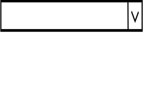
Combobox allow to choose item (value) from predefine list. If the value in the control system is not in the list it is automatically added.
|
Data points |
Optional |
Description |
|
value |
|
Datapoint where values are written after select. |
|
refresh_from |
True |
If set the state of the component is updated based on the value read from this datapoint. Otherwise the value from main datapoint is used. |
|
values |
True |
Datapoint which point to list of value/descriptions separated by | eg. 0: NOK | 1: OK (typicaly pupstr parameter of CNE block). If set the values parameter is ignored. |
|
hide_by |
True |
If non-zero the component is hidden. |
|
disable_by |
True |
If non-zero the component is disabled. |
|
readonly_by |
True |
If non-zero the component will change once to read-only mode. |
|
Options |
Type |
Description |
|
values |
table |
Define value:desc pairs for the combobox list. Value is number or string and desc is it’s string description. |
|
showValue |
bool |
If True the values are shown in the list eg. 0:OK |
|
valueType |
enum |
Choose if the value is read as a number or string. |
|
fontScale |
float |
Use this parameter to scale the font because the Combobox is using HTML select component which is not binded with SVG. |
|
writePerm |
table |
List of logins who are allowed to write to the data point. If not in list the ComboBox will be disabled. |
|
|
||
|
|
||
ControlLed

Simple boolean state indicator. Empty or Zero mean OFF, otherwise ON.
|
Data points |
Optional |
Description |
|
value |
|
Datapoint from which the LED state is read. |
|
disable_by |
True |
If non-zero the component is disabled. |
|
hide_by |
True |
If non-zero the component is hidden. |
|
Options |
Type |
Description |
|
reverseMeaning |
bool |
If True the meaning of the value is switched. So the ON state is False and OFF state is True. |
|
color_true |
color |
The ON state color. |
|
color_false |
color |
The OFF state color. |
|
|
||
|
|
||
CustomHTML
CustomHTML component allows inserting custom HTML to the HMI. It creates empty DIV element which is filled with content from the html parameter. It can be used for example for including the live camera feed.
|
Options |
Type |
Description |
|
html |
str |
Custom HTML content which is insert directly to the HMI. |
|
|
||
|
|
||
Display

Display component shows value from the target system as a string. It can be either number, date, datetime or simple value as a text string depending on the format property. Each display can have units which are shown at the end of the displayed string.
|
Data points |
Optional |
Description |
|
value |
|
Datapoint from which the value is read. |
|
disable_by |
True |
If non-zero the component is disabled and data are no longer updated. |
|
hide_by |
True |
If non-zero the component is hidden. |
|
Options |
Type |
Description |
|
format |
enum |
number - If selected the read value is converted
to the number either integer or float. Also the
parameters scale,offset and decimals are applied
during conversion. The color of the text depends
on the color property if the value is higher than
rangeMax the colorAbove is used likewise if the value
is lower than rangeMin the colorBelow is applied. |
|
text_format |
enum |
Select the format of the time string for time and datetime. |
|
scale |
float |
Scale the read value. Applicable for number format only. |
|
offset |
float |
Add some offset to the read value. Applicable for number format only. |
|
decimals |
int |
Round the read value to defined number of decimals. Applicable for number format only. |
|
color |
color |
Normal font color of the display. Applicable for number format only. |
|
colorAbove |
color |
Font color of the display when the read value is above rangeMax. Applicable for number format only. |
|
colorBelow |
color |
Font color of the display when the read value is below rangeMin. Applicable for number format only. |
|
rangeMax |
float |
When the read value is above rangeMax the colorAbove color is applied to the font. Applicable for number format only. |
|
rangeMin |
float |
When the read value is below rangeMin the colorBelow color is applied to the font. Applicable for number format only. |
|
units |
str |
Append some string to the end of the displayed value. Usually the name of the units. |
|
|
||
|
|
||
DisplayMatrix
Display Matrix show arbitrary array from target. Just point value datapoint to array. For example CNA:acn or MX_MAT:ay.
|
Data points |
Optional |
Description |
|
value |
|
The value from the datapoint will be show as a matrix. |
|
disable_by |
True |
If non-zero the component is disabled and data are no longer updated. |
|
hide_by |
True |
If non-zero the component is hidden. |
|
Options |
Type |
Description |
|
transpose |
bool |
If True display the transposed matrix. |
|
fontScale |
float |
Use this parameter to scale font. |
|
decimals |
int |
Round the cell value to defined number of decimals. |
|
header |
table |
Table header, an array of string labels for each column. |
|
showLineNumbers |
bool |
If True the line number will be added to the first column. |
|
divClass |
string |
Custom CSS class for components main DIV element. Space separated string list. |
|
tableClass |
string |
Custom CSS class for HTML table element. Space separated string list. |
|
|
||
|
|
||
DisplayMatrixExt
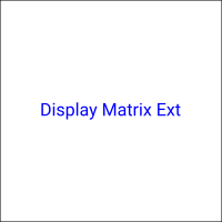
Display Matrix show arbitrary array from target. Just point value datapoint to array. For example CNA:acn or MX_MAT:ay.
|
Data points |
Optional |
Description |
|
value |
|
The value from the datapoint will be show as a matrix. |
|
row |
|
If non zero, the row will be selected. |
|
disable_by |
True |
If non-zero the component is disabled and data are no longer updated. |
|
hide_by |
True |
If non-zero the component is hidden. |
|
Options |
Type |
Description |
|
transpose |
bool |
If True display the transposed matrix. |
|
fontScale |
float |
Use this parameter to scale font. |
|
decimals |
int |
Round the cell value to defined number of decimals. |
|
header |
table |
Table header, an array of string labels for each column. |
|
showLineNumbers |
bool |
If True the line number will be added to the first column. |
|
divClass |
string |
Custom CSS class for components main DIV element. Space separated string list. |
|
tableClass |
string |
Custom CSS class for HTML table element. Space separated string list. |
|
transformFcn |
string |
This body of the function will be evaluated as ‘function transform(row,column,value)‘ and expect ‘value‘ as result. |
|
|
||
|
|
||
DisplayString

The Display string component reads the value from the target and display it as a text. It can
simply display the read value format: text or lookup the value in the table alt (alternative
lookup table) of descriptions.
Note:If the value contains newline sign the text is wrapped.
|
Data points |
Optional |
Description |
|
value |
|
Datapoint from which the value is read. |
|
disable_by |
True |
If non-zero the component is disabled and data are no longer updated. |
|
hide_by |
True |
If non-zero the component is hidden. |
|
Options |
Type |
Description |
|
format |
enum |
text - show the read value as is. |
|
showValue |
bool |
If True prepend the value in front of the description
separated by colon. |
|
values |
table |
List of value:desc pairs where the description is looked up when the value is read. |
|
|
||
|
|
||
DisplayWithBox
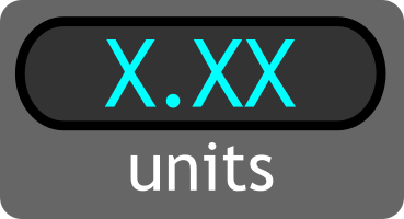
Display component shows value from the target system as a string. It can be either number, date or datetime string depending on the format property. Each display can have units which are shown at the bottom of the box.
|
Data points |
Optional |
Description |
|
value |
|
Datapoint from which the value is read. |
|
disable_by |
True |
If non-zero the component is disabled and data are no longer updated. |
|
hide_by |
True |
If non-zero the component is hidden. |
|
Options |
Type |
Description |
|
format |
enum |
number - If selected the read value is converted
to the number either integer or float. Also the
parameters scale,offset and decimals are applied
during conversion. The color of the text depends
on the color property if the value is higher than
rangeMax the colorAbove is used likewise if the value
is lower than rangeMin the colorBelow is applied. |
|
scale |
float |
Scale the read value. Applicable for number format only. |
|
offset |
float |
Add some offset to the read value. Applicable for number format only. |
|
decimals |
int |
Round the read value to defined number of decimals. Applicable for number format only. |
|
color |
color |
Normal font color of the display. Applicable for number format only. |
|
colorAbove |
color |
Font color of the display when the read value is above rangeMax. Applicable for number format only. |
|
colorBelow |
color |
Font color of the display when the read value is below rangeMin. Applicable for number format only. |
|
rangeMax |
float |
When the read value is above rangeMax the colorAbove color is applied to the font. Applicable for number format only. |
|
rangeMin |
float |
When the read value is below rangeMin the colorBelow color is applied to the font. Applicable for number format only. |
|
units |
str |
Append some string to the end of the displayed value. Usually the name of the units. |
|
|
||
|
|
||
Gauge180
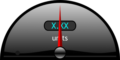
A Gauge displays the read value on the scale using the arm. The range of the scale is limited by rangeMin and rangeMax parameters. The scale is divided to some main steps using mainTickStep parameter and more using tickStep. Also the read value is displayed as a number rounded to decimals. If the read value is beyond the limits the Gauge’s border changes to colorOffLimits color. The Gauge also contain special kind of color scale which is defined by colorZones table. For example it can be used for defining the normal, warning and error levels.
|
Data points |
Optional |
Description |
|
value |
|
Datapoint from which the value is read. |
|
disable_by |
True |
If non-zero the component is disabled and data are no longer updated. |
|
hide_by |
True |
If non-zero the component is hidden. |
|
Options |
Type |
Description |
|
rangeMin |
float |
The minimum value for the Gauge scale. |
|
rangeMax |
float |
The maximum value for the Gauge scale. |
|
tickStep |
float |
Draw tick every tickStep value to the scale. |
|
mainTickStep |
float |
Draw main tick every mainTickStep value to the scale with text description. |
|
decimals |
float |
Round the read value to defined number of decimals. |
|
units |
str |
Name of the units or just text description. |
|
colorZones |
table |
Defines the special scale with color segments starting from startValue and ending at endValue colored by color. |
|
colorOffLimits |
color |
Border color when read value is of the range. |
|
|
||
|
|
||
Gauge270
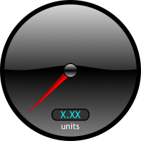
A Gauge displays the read value on the scale using the arm. The range of the scale is limited by rangeMin and rangeMax parameters. The scale is divided to some main steps using mainTickStep parameter and more using tickStep. Also the read value is diplayed as a number rounded to decimals. If the read value is beyond the limits the Gauge’s border changes to colorOffLimits color. The Gauge also contain special kind of color scale which is defined by colorZones table. For example it can be use for defining the normal, warning and error levels.
|
Data points |
Optional |
Description |
|
value |
|
Datapoint from which the value is read. |
|
disable_by |
True |
If non-zero the component is disabled and data are no longer updated. |
|
hide_by |
True |
If non-zero the component is hidden. |
|
Options |
Type |
Description |
|
rangeMin |
float |
The minimum value for the Gauge scale. |
|
rangeMax |
float |
The maximum value for the Gauge scale. |
|
tickStep |
float |
Draw tick every tickStep value to the scale. |
|
mainTickStep |
float |
Draw main tick every mainTickStep value to the scale with text description. |
|
decimals |
float |
Round the read value to defined number of decimals. |
|
units |
str |
Name of the units or just text description. |
|
colorZones |
table |
Defines the special scale with color segments starting from startValue and ending at endValue colored by color. |
|
colorOffLimits |
color |
Border color when read value is of the range. |
|
|
||
|
|
||
GaugeBars
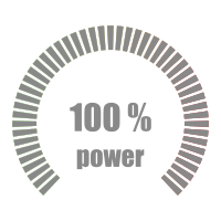
The GaugeBars component show the current value as a number of highlighted ticks. The value should be between rangeMin and rangeMax. Also the read value is diplayed as a number rounded to decimals with possible units string.
|
Data points |
Optional |
Description |
|
value |
|
Datapoint from which the value is read. |
|
Options |
Type |
Description |
|
rangeMin |
float |
The minimum value for the Gauge. |
|
rangeMax |
float |
The maximum value for the Gauge. |
|
decimals |
int |
Round the read value to defined number of decimals. |
|
units |
str |
Name of the units or just text description. |
|
|
||
|
|
||
GaugeGradient
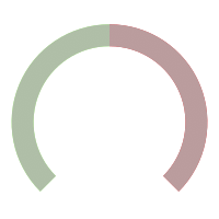
The GaugeGradient component show the current value as a fill of the arc. The value should be between rangeMin and rangeMax. The min value means whole arc is red the max value is whole arc is green.
|
Data points |
Optional |
Description |
|
value |
|
Datapoint from which the value is read. |
|
Options |
Type |
Description |
|
rangeMin |
float |
The minimum value for the Gauge. |
|
rangeMax |
float |
The maximum value for the Gauge. |
|
|
||
|
|
||
ImageChanger

Image Changer component loads image (*.png,*.jpg,*.bmp,*.svg etc.) and displays it inside its
boundaries. The image is refreshed when the refresh_from datapoint changes or after given
period. The imagePath should be relative to the root of the webserver. If the appendKey
property is True and the imagePath contains {0} sign, the sign is replaced using the read
value.
Example of the imagePath /hmi/images/img-{0}.png and value can change from 0 to 10,
etc.
|
Data points |
Optional |
Description |
|
refresh_from |
True |
When the value is changed the image is updated. |
|
hide_by |
True |
If non-zero the component is hidden. |
|
disable_by |
True |
If non-zero the component is disabled and data are no longer updated. |
|
Options |
Type |
Description |
|
imagePath |
str |
Relative path from the webserver root where the image is located. |
|
appendKey |
bool |
If True the {0} is replaces with current refresh_from value in the imagePath property. |
|
period |
int |
If larger than zero the image will be automatically refreshed based on the given period in milliseconds. The refresh_from datapoint is used only for appendKey mode. |
|
preserveAspectRatio |
enum |
Value for the preserveAspectRatio attribute of the SVG image element. |
|
|
||
|
|
||
Input
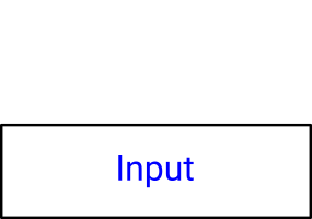
Input component allows to write numbers, texts, dates or times to the target. If the
number format is selected the value can be converted using scale and offset adn
rounded to number of decimals. The Input allows to limit user input to the range
defined by min and max parameters. The date and datetime format has a special
widget to enter the dates. The value from this format is converted to the number of
milliseconds from REXYGEN epoch.(datetime - ’HH:mm’, datetime-seconds -
’HH:mm:ss’)
The time format converts value to numbers of seconds.(time - ’HH:mm’, time-seconds -
’HH:mm:ss’)
Note:The value is written to the value datapoint, if necessary it can be refresh from different
location defined in the refresh_from datapoint. It can be used if the value is limited by
saturation.
|
Data points |
Optional |
Description |
|
value |
|
Datapoint where the value is written. |
|
refresh_from |
True |
Optional datapoint where the value is updated. |
|
hide_by |
True |
If non-zero the component is hidden. |
|
disable_by |
True |
If non-zero the component is disabled and data are no longer updated. |
|
readonly_by |
True |
If non-zero the component will change once to read-only mode. |
|
Options |
Type |
Description |
|
format |
enum |
number - If selected the value is converted to the
number either integer or float. Also the parameters
scale,offset and decimals are applied during
conversion. |
|
fontScale |
float |
The Input is using HTML input component which is not binded with SVG. Use this parameter to scale font. |
|
textAlign |
enum |
The Input is using HTML input component which is not binded with SVG. Use this parameter to scale font. |
|
scale |
float |
Scale the value. Applicable for number format only. |
|
offset |
float |
Add some offset to the value. Applicable for number format only. |
|
decimals |
int |
Round the value to defined number of decimals. Applicable for number format only. |
|
digits |
int |
Total number of digits without decimals. Remaining digits will be filled with zeros. Applicable for number format only. |
|
min |
float |
The minimum value user can enter. Applicable for number format only. |
|
max |
float |
The maximum value user can enter. Applicable for number format only. |
|
setOnBlur |
bool |
If True the data input value is set on blur event (Press ESC to cancel write). |
|
css |
object |
Custom CSS style for the HTML input object. For example {"background-color":"#00ffff"} |
|
writePerm |
table |
List of logins who are allowed to write to the data point. If not in list the Input will be disabled. |
|
|
||
|
|
||
Led

Boolean state indicator. Empty or Zero mean OFF,FALSE, otherwise ON, TRUE. This can be switched using reverseMeaning parameter.
|
Data points |
Optional |
Description |
|
value |
|
Datapoint from which the value is read. |
|
error_by |
True |
If set and TRUE the led will show colorError |
|
disable_by |
True |
If non-zero the component is disabled and data are no longer updated. |
|
hide_by |
True |
If non-zero the component is hidden. |
|
Options |
Type |
Description |
|
reverseMeaning |
bool |
If True the meaning of the value is switched. So the ON state is False and OFF state is True. |
|
colorTrue |
color |
LED background color when the signal is ON, ENABLED, ... |
|
colorFalse |
color |
LED background color when the signal is OFF, DISABLED, ... |
|
colorError |
color |
LED background color when the signal error is TRUE. |
|
|
||
|
|
||
LedLabel
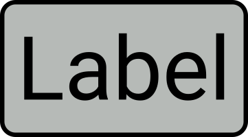
State indicator with text label. Define states with colors and labels using values table. Omit color string if not used (e.g. stroke color)
|
Data points |
Optional |
Description |
|
value |
|
Datapoint from which the LED state is read. |
|
hide_by |
True |
If non-zero the component is hidden. |
|
disable_by |
True |
If non-zero the component is disabled and data are no longer updated. |
|
Options |
Type |
Description |
|
values |
table |
List of labels and colors which will be shown when value changes. The priority is in asscending order. If any item in the values table is empty string, the look will not be changed. |
|
line_height |
str |
Line height of the multiline text used for dy tspan attribute. THIS parameter is used if only there is not a sufficient number of tspan nodes. |
|
|
||
|
|
||
PushOnOff

The PushOnOff button component changes the boolean value. Normally the ON state means
TRUE value and OFF mean FALSE value. If needed the parameter reverseMeaning switches
the written values.
There are three different modes of operation:
PushButton when press or touched the ON state is written to the target value datapoint.
When released the OFF state is written.
ManualPulse always write TRUE value after button is pressed, release is ignored.(Suitable for
MP block control)
ToggleButton when button is pressed the value is toggled (ON -> OFF -> ON).
|
Data points |
Optional |
Description |
|
value |
|
Datapoint where boolean value is written. |
|
refresh_from |
True |
If set the state of the component is updated based on the value read from this datapoint. Otherwise the value from main datapoint is used. |
|
hide_by |
True |
If non-zero the component is hidden. |
|
disable_by |
True |
If non-zero the component is disabled and data are no longer updated. |
|
readonly_by |
True |
If non-zero the component will change once to read-only mode. |
|
Options |
Type |
Description |
|
type |
enum |
Changes the type of the Button. |
|
reverseMeaning |
bool |
If True the meaning of the value is switched. So the ON state is False and OFF state is True. |
|
colorFalse |
color |
Button background color when the state is OFF |
|
colorTrue |
color |
Button background color when the state is ON |
|
writePerm |
table |
List of logins who are allowed to write to the data point. If not in list the Button will be disabled. |
|
|
||
|
|
||
SimpleLogger
Simple logger component write list of separated lines / logs. It can be used in two modes based on
the format parameter. Each line can be prepend with timestamp using local (client)
time. Whole log is limited to the max number of lines. Parameter format have to
options:
text - Simply log when the datapoint value changes.
alt - When datapoint value changes the description for the value is look up in texts table. If
not found the value is logged. The value is prepend to description if showValue is
enabled.
|
Data points |
Optional |
Description |
|
value |
|
The value from the datapoint will be logged in the logger. |
|
disable_by |
True |
If non-zero the component is disabled and data are no longer updated. |
|
hide_by |
True |
If non-zero the component is hidden. |
|
Options |
Type |
Description |
|
format |
enum |
The format of the logged message. Either pure text or alt analog value lookup table. |
|
texts |
table |
The lookup table with value and description (desc) pairs. Available for alt format. |
|
lines |
int |
Maximum number of row / lines in the logger. |
|
showValue |
bool |
If True the value is prepend before description from texts table. |
|
ignoreEmptyValues |
bool |
If True the logger will ignore all values with no description. |
|
timestamp |
bool |
If True the local client time timestamp will be shown. |
|
timestampFormat |
enum |
String format of the timestamp. See GlobalizeJS library form more formats. |
|
useTargetTime |
bool |
If True the timestamp value is read from the target. |
|
css |
object |
Custom CSS style for the HTML logger as a JSON object. For example {’background-color’:’#00ffff’} |
|
|
||
|
|
||
SliderHorizontal

Slider sets integer or floating value to the target. The range of the slider is limited between the min and max value. Slider move is split to several steps. The value can be converted using scale and offset and rounded to chosen number of decimals. The fontScale applies to the displayed value. Each slider has a label.
|
Data points |
Optional |
Description |
|
value |
|
The main datapoint where numeric value is written. |
|
active |
True |
If set the slider periodically write boolean TRUE value to the datapoint when the slider is pressed or moving. |
|
refresh_from |
True |
If set the state of the component is updated based on the value read from this datapoint. Otherwise the value from main datapoint is used. |
|
disable_by |
True |
If non-zero the component is disabled and data are no longer updated. |
|
hide_by |
True |
If non-zero the component is hidden. |
|
readonly_by |
True |
If non-zero the component will change once to read-only mode. |
|
Options |
Type |
Description |
|
min |
float |
The minimum slider value. |
|
max |
float |
The maximum slider value. |
|
step |
float |
The size of step (increment) when slider moves. |
|
label |
str |
The text description. |
|
fontScale |
float |
The fontScale of the displayed value. If set to 1 the font size is default. The floating number above 1 increase the font size. |
|
scale |
float |
Scale the number when read. The equation is scale*val+offset. The number is converted back when written. |
|
offset |
float |
Offset the number when read. The equation is scale*val+offset. The number is converted back when written. |
|
decimals |
int |
Round the number when read. |
|
writeOnChange |
bool |
If true the value is written to the target when the slider is moving. |
|
|
||
|
|
||
SliderVertical

Slider sets integer or floating value to the target. The range of the slider is limited between the min and max value. Slider move is split to several steps. The value can be converted using scale and offset and rounded to chosen number of decimals. The fontScale applies to the displayed value. Each slider has a label.
|
Data points |
Optional |
Description |
|
value |
|
The main datapoint where numeric value is written. |
|
active |
True |
If set the slider periodically write boolean TRUE value to the datapoint when the slider is pressed or moving. |
|
refresh_from |
True |
If set the state of the component is updated based on the value read from this datapoint. Otherwise the value from main datapoint is used. |
|
disable_by |
True |
If non-zero the component is disabled and data are no longer updated. |
|
hide_by |
True |
If non-zero the component is hidden. |
|
readonly_by |
True |
If non-zero the component will change once to read-only mode. |
|
Options |
Type |
Description |
|
min |
float |
The minimum slider value. |
|
max |
float |
The maximum slider value. |
|
step |
float |
The size of step (increment) when slider moves. |
|
label |
str |
The text description. |
|
fontScale |
float |
The fontScale of the displayed value. If set to 1 the font size is default. The floating number above 1 increase the font size. |
|
scale |
float |
Scale the number when read. The equation is scale*val+offset. The number is converted back when written. |
|
offset |
float |
Offset the number when read. The equation is scale*val+offset. The number is converted back when written. |
|
decimals |
int |
Round the number when read. |
|
writeOnChange |
bool |
If true the value is written to the target when the slider is moving. |
|
|
||
|
|
||
Switch

Switch changes the values from the predefine list. Each position write defined value to the target device. Click mouse button or tap to change position clockwise (CW). Double click or double tap to change position counterclockwise (CCW).
|
Data points |
Optional |
Description |
|
value |
|
Datapoint where value is written. |
|
refresh_from |
True |
If set the state of the component is updated based on the value read from this datapoint. Otherwise the value from main datapoint is used. |
|
disable_by |
True |
If non-zero the component is disabled and data are no longer updated. |
|
hide_by |
True |
If non-zero the component is hidden. |
|
readonly_by |
True |
If non-zero the component will change once to read-only mode. |
|
Options |
Type |
Description |
|
positions |
table |
List of switch positions with values. |
|
hideTooltips |
bool |
If TRUE the tooltip with values on each position are not shown. |
|
|
||
|
|
||
SwitchOnOff

|
Data points |
Optional |
Description |
|
value |
|
Datapoint where boolean value is written. |
|
refresh_from |
True |
If set the state of the component is updated based on the value read from this datapoint. Otherwise the value from main datapoint is used. |
|
hide_by |
True |
If non-zero the component is hidden. |
|
disable_by |
True |
If non-zero the component is disabled and data are no longer updated. |
|
readonly_by |
True |
If non-zero the component will change once to read-only mode. |
|
Options |
Type |
Description |
|
reverse_meaning |
bool |
If True the meaning of the value is switched. So the ON state is False and OFF state is True. |
|
labelColorFalse |
color |
Label (text) color when the state is OFF. |
|
labelColorTrue |
color |
Label (text) color when the state is ON |
|
writePerm |
table |
List of logins who are allowed to write to the data point. If not in list the Button will be disabled. |
|
|
||
|
|
||
SwitchOnOff2

The SwitchOnOff component changes the boolean value. Normally the ON state means TRUE value and OFF mean FALSE value. If needed the parameter reverseMeaning reverse the written values.
|
Data points |
Optional |
Description |
|
value |
|
The main datapoint where boolean value is written. |
|
refresh_from |
True |
If set the state of the component is updated based on the value read from this datapoint. Otherwise the value from main datapoint is used. |
|
hide_by |
True |
If non-zero the component is hidden. |
|
disable_by |
True |
If non-zero the component is disabled. |
|
readonly_by |
True |
If non-zero the component will change once to read-only mode. |
|
Options |
Type |
Description |
|
reverseMeaning |
bool |
If True the meaning of the value is switched. So the ON state is False and OFF state is True. |
|
label |
str |
Text written next to the switch |
|
writePerm |
table |
List of logins who are allowed to write to the data point. If not in list the Button will be disabled. |
|
|
||
|
|
||
TRND
The TRND component is used for displaying the signals from the TRND blocks. Simply just set TRND datapoint to any parameter of the TRND block eg. taskname.TRND:u1. All signals will be displayed in the trend. Each signal can be labeled using signals table.
|
Data points |
Optional |
Description |
|
TRND |
|
Set the datapoint to any parameter of the TRND block eg. taskname.TRND:u1 to enable reading of all signals. |
|
ViewConfig |
True |
If set the graph configuration is loaded from JSON string. If not the ViewConfig is loaded from TRND block. The configuration is loaded once after the page is loaded. The refresh must be done manually from the menu. |
|
reset_by |
True |
If non-zero the data from trend are deleted. |
|
hide_by |
True |
If non-zero the component is hidden. |
|
disable_by |
True |
If non-zero the component is disabled and data are no longer updated. |
|
Options |
Type |
Description |
|
title |
str |
Trend title |
|
signals |
table |
Table of signal labels. Write labels in the same order as you connect the signals to the TRND block. |
|
bufferSize |
int |
The size of the buffer in the client web browser. If -1
the target TRND block buffer size is used. |
|
refreshRate |
int |
Custom refresh rate of the trend. Normally the trend is refreshed with the HMI main refresh rate period. If needed each trend can have custom one. |
|
hideLegend |
bool |
Hide the legend of the graph. |
|
hideRangeSelector |
bool |
Hide the range selector bellow the graph. |
|
yAxis |
table |
Table of basic parameters for Y axis. Only first row is used! |
|
dygraphOptions |
object |
Custom options for Dygraph library. See http://dygraphs.com/options.html for more info. |
|
|
||
|
|
||
3.4.4 HOME
AirCirculator

|
Data points |
Optional |
Description |
|
POWER |
|
If non-zero the component is enabled. |
|
Options |
Type |
Description |
|
colorRun |
color |
Component color when enabled / running. |
|
colorStop |
color |
Component color when disabled / stopped. |
|
|
||
|
|
||
Boiler

The boiler show progress of heating. If the currentTemp is less than setTemp the flames are visible.
|
Data points |
Optional |
Description |
|
POWER |
|
If non-zero the component is enabled. |
|
setTemp |
|
Boiler temperature set-point. |
|
currentTemp |
|
Current temperature. |
|
Options |
Type |
Description |
|
|
||
|
|
||
Filter

The filter show if filtration is in progress.
|
Data points |
Optional |
Description |
|
POWER |
|
If non-zero the component is enabled. |
|
Options |
Type |
Description |
|
colorOn |
color |
Component color when enabled / running. |
|
colorOff |
color |
Component color when disabled / stopped. |
|
|
||
|
|
||
HandleValve
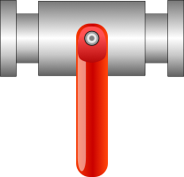
The valve controller. It switch the value when clicked.
|
Data points |
Optional |
Description |
|
FLOW |
|
State of the valve. |
|
refresh_from |
True |
If set the state is read from this datapoint. |
|
Options |
Type |
Description |
|
|
||
|
|
||
HandleValveT
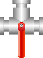
The three state valve controller. When clicked it toggle two boolean values.
|
Data points |
Optional |
Description |
|
FLOW1 |
|
State of the valve. |
|
FLOW2 |
|
State of the valve. |
|
refresh_from |
True |
If set the state is read from this datapoint. It expect integer number 0 - unknown, 1 - True-False state, 2 - False-True state. |
|
Options |
Type |
Description |
|
|
||
|
|
||
Heater

The heater show when the heating is active and what is the current temperature. The color changes from colorMin when the value is less than colorSignalMin and colorMax when the value is greater than colorSignalMax.
|
Data points |
Optional |
Description |
|
POWER |
|
If non-zero the heater is active. |
|
currentTemp |
|
Current temperature. |
|
Options |
Type |
Description |
|
heatingColor |
color |
The color of the heating spiral when active. |
|
colorMin |
color |
The color of the medium when the current temperature is low. |
|
colorMax |
color |
The color of the medium when the current temperature is high. |
|
colorSignalMin |
float |
The minimum level of the value. |
|
colorSignalMax |
float |
The maximum level of the value. |
|
|
||
|
|
||
Motor

|
Data points |
Optional |
Description |
|
POWER |
|
If non-zero the motor is active. |
|
Options |
Type |
Description |
|
colorRun |
color |
The color when motor is enabled / running. |
|
colorStop |
color |
The color when motor is disabled / stopped. |
|
|
||
|
|
||
PipeElbow

The pipe changes the color based on the COLOR signal.
|
Data points |
Optional |
Description |
|
COLOR |
|
The value for color change (e.g. temperature of the pipe) |
|
Options |
Type |
Description |
|
colorMin |
color |
The color when the current temperature is bellow min. |
|
colorMax |
color |
The color when the current temperature is above max. |
|
colorSignalMin |
float |
The minimum temperature. |
|
colorSignalMax |
float |
The maximum temperature. |
|
|
||
|
|
||
PipeEnding
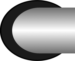
The pipe changes the color based on the COLOR signal.
|
Data points |
Optional |
Description |
|
COLOR |
|
The value for color change (e.g. temperature of the pipe) |
|
Options |
Type |
Description |
|
colorMin |
color |
The color when the current temperature is bellow min. |
|
colorMax |
color |
The color when the current temperature is above max. |
|
colorSignalMin |
float |
The minimum temperature. |
|
colorSignalMax |
float |
The maximum temperature. |
|
|
||
|
|
||
PipeStraight

The pipe changes the color based on the COLOR signal.
|
Data points |
Optional |
Description |
|
COLOR |
|
The value for color change (e.g. temperature of the pipe) |
|
Options |
Type |
Description |
|
colorMin |
color |
The color when the current temperature is bellow min. |
|
colorMax |
color |
The color when the current temperature is above max. |
|
colorSignalMin |
float |
The minimum temperature. |
|
colorSignalMax |
float |
The maximum temperature. |
|
|
||
|
|
||
PipeT

The pipe changes the color based on the COLOR signal.
|
Data points |
Optional |
Description |
|
COLOR |
|
The value for color change (e.g. temperature of the pipe) |
|
Options |
Type |
Description |
|
colorMin |
color |
The color when the current temperature is bellow min. |
|
colorMax |
color |
The color when the current temperature is above max. |
|
colorSignalMin |
float |
The minimum temperature. |
|
colorSignalMax |
float |
The maximum temperature. |
|
|
||
|
|
||
Pump
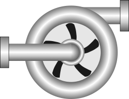
|
Data points |
Optional |
Description |
|
POWER |
|
If non-zero the pump is active. |
|
Options |
Type |
Description |
|
colorRun |
color |
The color when pump is enabled / running. |
|
colorStop |
color |
The color when pump is disabled / stopped. |
|
|
||
|
|
||
Radiator
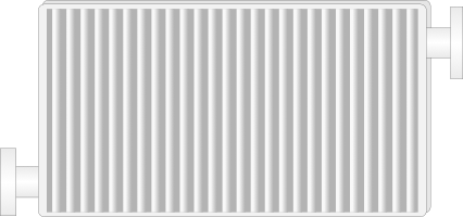
The radiator status indicator.
|
Data points |
Optional |
Description |
|
POWER |
|
If non-zero the heating is active. |
|
currentTemp |
|
Current temperature. |
|
Options |
Type |
Description |
|
inOutColor |
color |
The color of input and output when heating is active. |
|
colorMin |
color |
The color of the radiator when currentTemp is less than colorSignalMin. |
|
colorMax |
color |
The color of the radiator when currentTemp is more than colorSignalMax. |
|
colorSignalMin |
float |
Minimum value of the temperature. |
|
colorSignalMax |
float |
Maximum value of the temperature. |
|
|
||
|
|
||
Shower

|
Data points |
Optional |
Description |
|
POWER |
|
|
|
Options |
Type |
Description |
|
|
||
|
|
||
WaterBoiler

The water boiler component show progress of both heating and cooling. The state depend on
power value: 1 - heating
0 - none
-1 - cooling
|
Data points |
Optional |
Description |
|
power |
|
The state of the water boler: |
|
currentTemp |
|
|
|
Options |
Type |
Description |
|
heatingColor |
color |
The color of the spiral when boiler is heating. |
|
coolingColor |
color |
The color of the spiral when boiler is cooling. |
|
colorMax |
color |
The color when the current temperature is above max. |
|
colorMin |
color |
The color when the current temperature is bellow min. |
|
colorSignalMax |
float |
The maximum temperature. |
|
colorSignalMin |
float |
The minimum temperature. |
|
|
||
|
|
||
ExternalThermometer
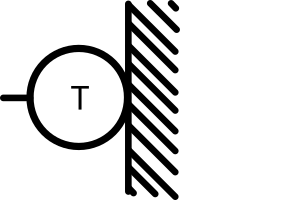
|
Data points |
Optional |
Description |
|
temp |
|
|
|
Options |
Type |
Description |
|
|
||
|
|
||
Fan
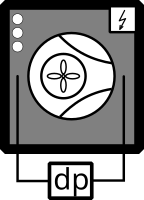
|
Data points |
Optional |
Description |
|
L1 |
|
|
|
L2 |
True |
|
|
L3 |
True |
|
|
OHEAT |
|
|
|
RUNNING |
|
|
|
Options |
Type |
Description |
|
|
||
|
|
||
FanLeft
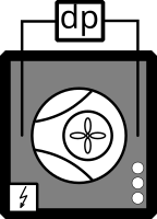
|
Data points |
Optional |
Description |
|
L1 |
|
|
|
L2 |
True |
|
|
L3 |
True |
|
|
OHEAT |
|
|
|
RUNNING |
|
|
|
Options |
Type |
Description |
|
|
||
|
|
||
GasBoiler
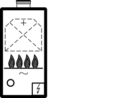
|
Data points |
Optional |
Description |
|
ERROR |
|
|
|
POWER |
|
|
|
Options |
Type |
Description |
|
flame1_on |
float |
|
|
flame2_on |
float |
|
|
flame3_on |
float |
|
|
flame4_on |
float |
|
|
flame_color |
color |
|
|
innerFlame_color |
color |
|
|
led_color |
color |
|
|
|
||
|
|
||
Pump

|
Data points |
Optional |
Description |
|
ON |
|
|
|
Options |
Type |
Description |
|
on_color |
color |
|
|
|
||
|
|
||
RotaryExchanger

|
Data points |
Optional |
Description |
|
ENABLE |
|
|
|
ICE |
|
|
|
OHEAT |
|
|
|
POWER |
|
|
|
Options |
Type |
Description |
|
|
||
|
|
||
Thermometer

|
Data points |
Optional |
Description |
|
temp |
|
|
|
Options |
Type |
Description |
|
|
||
|
|
||
Thermostat
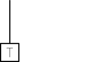
|
Data points |
Optional |
Description |
|
THERM |
|
|
|
Options |
Type |
Description |
|
|
||
|
|
||
ThermostatThree
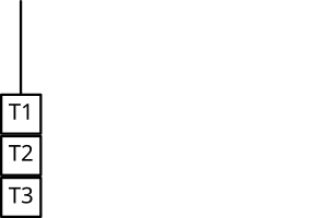
|
Data points |
Optional |
Description |
|
THERM |
|
|
|
THERMTHREE |
|
|
|
THERMTWO |
|
|
|
Options |
Type |
Description |
|
|
||
|
|
||
ThermostatTwo
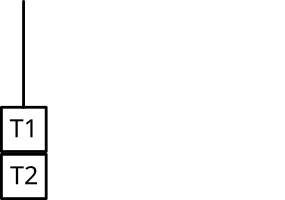
|
Data points |
Optional |
Description |
|
THERM |
|
|
|
THERMTWO |
|
|
|
Options |
Type |
Description |
|
|
||
|
|
||
TValve

|
Data points |
Optional |
Description |
|
OPEN |
|
|
|
Options |
Type |
Description |
|
open_color |
color |
|
|
|
||
|
|
||
3.4.5 PROC
HydroCyclons

|
Data points |
Optional |
Description |
|
value |
True |
Number of active cyclons |
|
disable_by |
True |
If non-zero the component is disabled and data are no longer updated. |
|
hide_by |
True |
If non-zero the component is hidden. |
|
Options |
Type |
Description |
|
|
||
|
|
||
HydroCyclons10

Graphical component for Hydrocyclons
|
Data points |
Optional |
Description |
|
active_by |
True |
Bitmask which set active color to the relevant cyclone. The lowers bit corresponds with rightest cyclone. |
|
blocked_by |
True |
Bitmask which set blocked color to the relevant cyclone. The lowers bit corresponds with rightest cyclone. The block has higher priority than active. |
|
disable_by |
True |
If non-zero the component is disabled and data are no longer updated. |
|
hide_by |
True |
If non-zero the component is hidden. |
|
Options |
Type |
Description |
|
colorActive |
color |
Color of the active cyclone. |
|
colorBlocked |
color |
Color of the blocked cyclone. |
|
|
||
|
|
||
HydroCyclons2

|
Data points |
Optional |
Description |
|
value |
True |
Number of active cyclons. |
|
hide_by |
True |
If non-zero the component is hidden. |
|
disable_by |
True |
If non-zero the component is disabled and data are no longer updated. |
|
Options |
Type |
Description |
|
|
||
|
|
||
Pump

|
Data points |
Optional |
Description |
|
active_by |
True |
If non-zero the pump is ON |
|
error_by |
True |
If non-zero the pump is in error. |
|
disable_by |
True |
If non-zero the component is disabled and data are no longer updated. |
|
hide_by |
True |
If non-zero the component is hidden. |
|
Options |
Type |
Description |
|
|
||
|
|
||
Reactor

|
Data points |
Optional |
Description |
|
value |
True |
The height of the level in the tank. |
|
active_by |
True |
If non-zero the reactor is ON |
|
error_by |
True |
If non-zero the reactor is in error. |
|
disable_by |
True |
If non-zero the component is disabled and data are no longer updated. |
|
hide_by |
True |
If non-zero the component is hidden. |
|
Options |
Type |
Description |
|
valueMin |
float |
|
|
valueMax |
float |
|
|
|
||
|
|
||
ReactorSmall

|
Data points |
Optional |
Description |
|
value |
True |
The height of the reactor in the tank. |
|
active_by |
True |
If non-zero the reactor is ON |
|
error_by |
True |
If non-zero the valve is in error. |
|
disable_by |
True |
If non-zero the component is disabled and data are no longer updated. |
|
hide_by |
True |
If non-zero the component is hidden. |
|
Options |
Type |
Description |
|
valueMin |
float |
|
|
valueMax |
float |
|
|
|
||
|
|
||
Tank

|
Data points |
Optional |
Description |
|
value |
True |
The height of the level in the tank. |
|
disable_by |
True |
If non-zero the component is disabled and data are no longer updated. |
|
hide_by |
True |
If non-zero the component is hidden. |
|
Options |
Type |
Description |
|
valueMin |
float |
|
|
valueMax |
float |
|
|
|
||
|
|
||
Valve

|
Data points |
Optional |
Description |
|
value |
True |
The height of the level in the tank. |
|
active_by |
True |
If non-zero the valve is ON |
|
error_by |
True |
If non-zero the valve is in error. |
|
disable_by |
True |
If non-zero the component is disabled and data are no longer updated. |
|
hide_by |
True |
If non-zero the component is hidden. |
|
Options |
Type |
Description |
|
valueMin |
float |
|
|
valueMax |
float |
|
|
|
||
|
|
||
Valve2

|
Data points |
Optional |
Description |
|
value |
True |
The height of the level in the tank. |
|
active_by |
True |
If non-zero the valve is ON |
|
error_by |
True |
If non-zero the valve is in error. |
|
disable_by |
True |
If non-zero the component is disabled and data are no longer updated. |
|
hide_by |
True |
If non-zero the component is hidden. |
|
Options |
Type |
Description |
|
valueMin |
float |
|
|
valueMax |
float |
|
|
|
||
|
|
||
Chapter 4
WebBuDi
4.1 Simple Buttons and Displays on the Web
WebBuDi is an acronym for Web Buttons and Displays, is a simple JavaScript file with several declarative blocks that describe data points which the HMI is connected to and assemble a table in which all the data is presented. It provides a textual interaction with selected signals and is suitable for system developers and integrators or may serve as a fall-back mode HMI for non-standard situations.
WebBuDi is composed from several rows (a graphical components with pre-defined function and look) connected to a single item in the control system (specified by an aliasor a cstring property). There are different rows according to the type they are changing (for boolean, numbers, dates, etc.). All rows are organized in sections (colored blocks which can have a heading). The sections are then organizes in several columns.
The configuration is done using JavaScript objects. See 4.1 for more details.
Example
2 // Simple PID controller example
3
4 // Optional - Add items first
5 REX.WebBuDi.addItems([
6 {alias: 'PID_MAN', cstring: 'pidcontrol_control.CNB_MAN:YCN', write: true}
7 ]);
8
9 // Add WebBuDi section
10 REX.WebBuDi.addSection({
11 column: 1,
12 title: 'User controls',
13 rows: [
14 {alias: 'PID_MAN', desc:'Controller mode', type: 'DW', label_false: 'AUT', label_true:'MAN'},
15 {type:'ES'},
16 {alias: 'SP_AW', cstring: 'pidcontrol_control.CNR_sp:ycn', desc:'Setpoint', type: 'AW'}
17 ]
18 });
19
20 // Show graph from TRND block
21 REX.HMI.Graph.addSignal({cstring: 'pidcontrol_control.TRND_PIDU', labels: ['Process value','Manipulated variable','Setpoint']});
22
23 // Set different target address
24 // REX.HMI.setTargetUrl('ws://192.168.1.100:8008/rex');
25
26 // Set refresh rate (Default: 500 ms)
27 REX.HMI.setRefreshRate(100);
28
29 // Change title of the page
30 REX.HMI.setTitle('Simple PID controller');
31}
.WebBuDi : object
- .addSection(opt) => REX.HMI.WebBuDi
- .add() => REX.HMI.WebBuDi
- .addItems(items) => Array.<REX.WS.Item>
REX.WebBuDi.addSection(opt) => REX.HMI.WebBuDi
The addSection adds new rows / HMI components to the web page.
The section contains all components defined in rows array. It can have title shown in header. The whole section can be controlled via disable_by and hide_by item. Finally the section is placed to the column (index based).
The function calls can be chained or called via alias REX.WebBuDi.add().
Kind: static method of WebBuDi
|
Param |
Type |
Default |
Description |
|
|
|||
|
opt |
|
|
The main configuration object |
|
opt.rows |
Array.< RowOption> |
|
Definition of all HMI components / rows. See the list for more details |
|
[opt.title] |
String |
|
Title of the section shown in the header. |
|
[opt.column] |
number |
1 |
Index of the column (starts from 1). |
|
[opt.background _color] |
String |
|
Custom background color of the section. |
|
[opt.text_color] |
String |
|
Custom text color of the section header |
|
[opt.disable_by] |
String | Object |
|
If defined by ’alias’ or object {alias:"XXX", cstring:"XXX", reverse_meaning:false} the state of the component changes (enabled / disabled). |
|
[opt.hide_by] |
String | Object |
|
If defined by ’alias’ or object {alias:"XXX", cstring:"XXX", reverse_meaning:false} the visibility of the row changes. |
|
[opt.customDivID] |
String |
”content” |
The ID of the element where all the columns / sections will be appended. |
|
|
|||
|
|
|||
|
|
|||
Example
2
3REX.WebBuDi.addSection({
4 column: 1,
5 title: 'Controls',
6 rows: [
7 // Digital write
8 {alias: 'PID_MAN', desc:'Controller mode', type: 'DW', label_false: 'AUT', label_true: 'MAN'},
9 // Analog write
10 {alias: 'SP', desc:'Setpoint', cstring: 'pidcontrol_control.CNR_sp:ycn', type: 'AW'},
11 {type: 'ES'}, // Empty space
12 ],
13 hide_by:"",
14 disable_by:""
15});
REX.WebBuDi.add() => REX.HMI.WebBuDi
Shortcut for REX.WebBudi.addSection function.
Kind: static method of WebBuDi
REX.WebBuDi.addItems(items) => Array.<REX.WS.Item>
Add several items at once. This is useful way how to define aliases and use them in various rows
Kind: static method of WebBuDi
|
Param |
Type |
Description |
|
|
||
|
items |
Array. <Object> |
Array of items to register. Shortcut for REX.HMI.addItems(). |
|
items.alias |
String |
|
|
items.cstring |
String |
|
|
items.write |
boolean |
Set true if item is writable |
|
|
||
|
|
||
|
|
||
Example
2 {alias: 'PID_MAN', cstring: 'pidcontrol_control.CNB_MAN:YCN', write: true},
3 {alias: 'SP_AW', cstring: 'pidcontrol_control.CNR_sp:ycn', write: true},
4 {alias: 'HV', cstring: 'pidcontrol_control.PIDU:hv'}
5]);
4.2 Available Rows and Components
- AnalogLookupTable (’ALT’)
- Analog Write (’AW’)
- Analog Read (’AR’)
- Digital Read (’DR’)
- Digital Write (’DW’)
- Empty Space (’ES’)
- Link Button (’LINK’)
- Manual Pulse (’MP’)
- Push Button (’PB’)
General row options - Every row is configured with common and row-specific properties. The following object represents the common part.
|
Name |
Type |
Description |
|
|
||
|
type |
String |
The type of the component / row (eg. ”AR”) |
|
alias |
alias |
UNIQUE identification of the item from control system (eg. ’SP’). Must NOT contain spaces or diacritics |
|
desc |
String |
Name of the component shown in the description (eg. ”Set point”). If the alias is not defined the desc is used instead. The desc is converted to lowercase, spaces are substitute with underscore and all non-ascii letters omitted or replaced with ascii equivalent. |
|
cstring |
String |
Connection string which contain whole path to the target device (eg. ”task.CNR:ycn”) |
|
disable_by |
String | Object |
If defined by ’alias’ or object {alias:"XXX", cstring:"XXX", reverse_meaning:false} the state of the component changes (enabled / disabled). |
|
hide_by |
String | Object |
If defined by ’alias’ or object {alias:"XXX", cstring:"XXX", reverse_meaning:false} the visibility of the row changes. |
|
refresh_from |
String |
If defined by ’alias’ or object {alias:"XXX", cstring:"XXX"} the value for the item is read from different location than written. It is applicable on for WRITE components |
|
|
||
|
|
||
|
|
||
2{alias:"SP", desc:"Set point", cstring:"task.CNR:ycn", disable_by:null, hide_by:null refresh_from:null}
4.2.1 AnalogLookupTable
AnalogLookupTable AnalogLookupTable (’ALT’) - Select with list of options. Used for user define enums.
|
Options |
Type |
Description |
|
show_key |
bool |
Append keys to the list of options |
|
values |
table |
List of all values which can be selected. It is a Object with key-value pairs (e.g. ‘{"1":"Options 1", "2":"Options 2"}‘) |
|
|
||
|
|
||
Example
4.2.2 AnalogReadRow
AnalogReadRow Analog Read (’AR’) - Periodical reading of selected value (‘date‘,‘time‘,‘datetime‘,‘text‘,‘number‘). ‘date‘, ‘datetime‘ - Show date calculated from seconds from REX Epoch timestamp. ‘time‘ - Show time calculated from seconds. ‘text‘ - Show the value without any transformation (suitable for string values). ‘number‘ - Show number transformed by ‘scale‘, ‘offset‘ and round to number of ‘decimals‘.
|
Options |
Type |
Description |
|
format |
bool |
One of the following ‘date‘,‘time‘,‘datetime‘,‘text‘,‘number‘ |
|
scale |
int |
Scale factor |
|
offset |
int |
Offset for the displayed value |
|
decimals |
int |
Number of decimals |
|
convert |
function |
If defined, the ‘format=’number’‘ value is transformed using convert function eg. ‘convert=function(val){return val+1;}‘ |
|
|
||
|
|
||
Example
2{type:'AR'}
3
4// Show date
5{type:'AR', format:'date'}
6
7// Show string values
8{type:'AR', format:'text'}
9
10// Convert radians to degrees
11{type:'AR', format:'number', scale:(Math.PI/180), offset:0, decimals:0}
4.2.3 AnalogWriteRow
AnalogWriteRow Analog Write (’AW’) - Set ‘date‘,‘time‘,‘datetime‘,‘text‘ or ‘number‘ to the control system. ‘date‘, ‘datetime‘ - R/W date calculated from seconds from REX Epoch timestamp. ‘time‘ - R/W time calculated from seconds. ‘text‘ - Write value without any transformation (suitable for string values). ‘number‘ - R/W number transformed by ‘scale‘, ‘offset‘ and rounded to number of ‘decimals‘.
|
Options |
Type |
Description |
|
format |
bool |
One of the following ‘date‘,‘time‘,‘datetime‘,‘text‘,‘number‘ |
|
scale |
int |
Scale factor |
|
offset |
int |
Offset for the displayed value |
|
min |
int |
Limit the minimum value |
|
max |
int |
Limit the maximum value |
|
decimals |
int |
Number of decimals |
|
set_on_blur |
bool |
If set the value is written when the input is blured. Use *ESC* to cancel changes |
|
convert |
function |
If defined, the ‘format=’number’‘ value is transformed using convert function eg. ‘convert=function(val){return val+1;}‘ |
|
convertW |
function |
If defined, the ‘format=’number’‘ value is transformed before write by convert function eg. ‘convertW=function(val){return val+1;}‘ |
|
|
||
|
|
||
Example
2{type:'AW'}
3
4// Set date
5{type:'AW', format:'date'}
6
7// Set string values
8{type:'AW', format:'text'}
9
10// Display degrees, read and write as radians
11{type:'AW', format:'number', scale:(Math.PI/180), offset:0, decimals:0}
12
13// Default options
14{type:'AW', format:'number',
15 scale:1, offset:0, min: Number.MAX_VALUE, max: Number.MAX_VALUE,
16 set_on_blur:false, convert:null, convertW:null}
4.2.4 DigitalReadRow
DigitalReadRow Digital Read (’DR’) - Periodical reading of boolean value.
|
Options |
Type |
Description |
|
label_false |
string |
Label for the false / off / disable value. |
|
label_true |
string |
Label for the true / on / enable value. |
|
label_color_false |
string |
Color of the label for the false / off / disable value. |
|
label_color_true |
string |
Color of the label for the true / on / enable value. |
|
reverse_meaning |
bool |
If set the ’0’ (zero) means enables / ON and ’1’ disabled / OFF |
|
color_false |
string |
Change color of FALSE button when active |
|
color_true |
string |
Change color of TRUE button when active |
|
|
||
|
|
||
Example
2
3// All options
4{type: 'DR', label_false: 'OFF(0)', label_true: 'ON(1)', reverse_meaning:false, color_false:'', color_true:''}
4.2.5 DigitalWriteRow
DigitalWriteRow Digital Write (’DW’) - Set boolean value
|
Options |
Type |
Description |
|
label_false |
string |
Label for the false / off / disable value. |
|
label_true |
string |
Label for the true / on / enable value. |
|
label_color_false |
string |
Color of the label for the false / off / disable value. |
|
label_color_true |
string |
Color of the label for the true / on / enable value. |
|
reverse_meaning |
bool |
If set the ’0’ (zero) means enables / ON and ’1’ disabled / OFF |
|
color_false |
string |
Change color of FALSE button when active |
|
color_true |
string |
Change color of TRUE button when active |
|
flip |
bool |
If set the position of the TRUE/FALSE buttons is flipped. |
|
|
||
|
|
||
Example
2
3// All options
4{type: 'DW', label_false: 'OFF(0)', label_true: 'ON(1)', reverse_meaning:false, color_false:'', color_true:'', flip:false}
4.2.6 EmptySpace
EmptySpace Empty Space (’ES’) - Creates empty row to fill gaps
|
Options |
Type |
Description |
|
|
||
|
|
||
Example
4.2.7 LinkButton
LinkButton Link Button (’LINK’) - Create link to different page
|
Options |
Type |
Description |
|
target_url |
string |
URL to which the link leads to. |
|
label |
string |
Button label |
|
|
||
|
|
||
Example
4.2.8 ManualPulseRow
ManualPulseRow Manual Pulse (’MP’) - Manual Pulse controller (for MP block). There are two types of this component. Either ‘type:’MP’‘ which write the TRUE value to the target cstring only once after the button is pressed. On the other hand ‘type:’MPRpt’‘ writes TRUE value periodically every 20 ms when button is pressed. This ca be used to prolong the MP button output.
|
Options |
Type |
Description |
|
color |
bool |
Button background color |
|
label |
int |
Buttons label |
|
labelColor |
int |
Button label’s color |
|
|
||
|
|
||
Example
2
3{alias: 'MP_RUN', cstring:"task.MP_RUN:BSTATE", type: 'MPRpt'}
4
5{alias: 'MP_RUN', label:'Press me', type: 'MP', color:REX.UTIL.CONSTANTS.COLORS.error, labelColor:'#000000'}
4.2.9 PushButton
PushButton Push Button (’PB’) - One button for setting different values on press and release.
|
Options |
Type |
Description |
|
label_false |
string |
Label for the false / off / disable value. |
|
label_true |
string |
Label for the true / on / enable value. |
|
reverse_meaning |
bool |
If set the ’0’ (zero) means enables / ON and ’1’ disabled / OFF |
|
color_false |
string |
Change color of FALSE button when active |
|
color_true |
string |
Change color of TRUE button when active |
|
value_release |
int | string |
Set the value which should be set on release (‘reverse_meaning do not apply‘). |
|
value_press |
int | string |
Set he value which should be set on press (‘reverse_meaning do not apply‘). |
|
|
||
|
|
||
Example
2{type: 'PB'}
3
4// Write float value
5{type: 'PB', value_release: 0, value_press: 0.1}
6
7// All options
8{type: 'PB', label_false: 'OFF(0)', label_true: 'ON(1)', reverse_meaning:false,
9 color_false:'', color_true:'', value_release: 0, value_press: 1}
Chapter 5
REX.HMI library
5.1 How to Use the Library
The user can program the HMI over REX.HMI interface. It contain several public methods for reading and writing items from REXYGEN targets. To create and build your custom HMI based on the RexHMI library follow these steps:
- Create project directory with exec.mdl. Add the HMI block to the executive (see the [2] for more details).
- Create *.hmi.js file in ./hmisrc directory with REX.HMI.init = function(){} function inside.
- Start writing your script.
When the script is ready, enable generation of RexHMI using GenerateRexHMI parameter in the HMI block of the executive. Then run Compile and Download function in the REXYGEN Studio. The content of the *.hmi.js file is inserted to the RexHMI template with all the necessary scripts and libraries, also all other content of the hmisrc directory is copied to the target ./hmi folder. The HMI is then downloaded to the target and available from the internal webserver.
The REX.HMI interface is described in following sections. Each function contain short example with common parameters.
2// Append this function to the HTML document or use predefined placeholder in the template
3REX.HMI.init = function(){
4// Change some basic settings
5
6}
5.2 Reference Guide for REX.HMI
The main entry-point for all RexHMI visualization. This class exposes all methods necessary for reading and writing variables in control scheme over WebSockets.
Emits: event:time, event:online, event:offline
|
Name |
Type |
Description |
|
|
||
|
REX.HMI.kioskMode |
boolean |
Set true to enable kioskMode od the HMI |
|
REX.HMI.disableAutoReload |
boolean |
Set to true if autoreload of the web page should be disabled Autoreload is call when the REXYGEN executive or HMI changes. This can be useful if general signals are read to Graph and one do not want to loose history |
|
|
||
|
|
||
|
|
||
List of all available functions
- .init()
- .connect() =>Promise
- .disconnect()
- .getTarget(url) =>WSTarget
- .setTargetUrl(url, force) =>Promise
- .setRefreshRate(period)
- .addItem(opt) =>Item
- .addItems(items) =>Array.<Item>
- .removeItem(alias) =>Promise
- .get(alias) =>Item
- .$i(alias) =>Item
- .addGroup(g)
- .removeGroup(g)
- .addTrend(t)
- .removeTrend(t)
- .writeValues(aliases, values) =>Promise
- .setTitle(title)
- .setHeaderTitle(title)
- .showHeartBeatClock(show)
- .useClientTime(use)
- .getItemsEventSynchonizer(aliases, events) =>EventSync
- .commit() =>Promise
This method can be override by the user. The init is called when the websocket connection is opened and one can add own items for RW operations. The method can be called either synchronously or asynchronously with callback. Example of the REX.HMI.init function is part of the HTML template
Example
2REX.HMI.init = function(){
3REX.HMI.addItem({alias:"SP", cstring:"task.block:param"});
4}
5
6// Init with callback
7REX.HMI.init = function(done){
8done();
9}
Connect the RexHMI to the target. This function is called automatically
Disconnect all items from the target. Stop reading and dispose connections to all targets.
REX.HMI.getTarget(url) =>WSTarget
Return REXYGEN target base on the given URL. If URL is null (the most common case) then it returns the default target.
|
Param |
Type |
Description |
|
|
||
|
url |
String |
URL of the requested target |
|
|
||
|
|
||
|
|
||
Example
2REX.HMI.getTarget().getVersion().then((data)=>{console.log(data)})
REX.HMI.setTargetUrl(url, force) =>Promise
Sets the new default target URL. When the page is served from server (not localhost) and the location.hostname is set the setTargetURL function sets NULL to use default targetURL. So the target connects to the location which the page is served from.
This behaviour can be changed by setting the force parameter tu true. Than the ‘url’ will be used on any occasion.
|
Param |
Description |
|
|
|
|
url |
URL of the target |
|
force |
set true if the URL should be set even run from server with hostname |
|
|
|
|
|
|
|
|
|
Example
2// If run locally from file:// connect to IP, when uploaded to server (RexCore)
3// then connect to location.hostname
4REX.HMI.setTargetUrl("ws://192.168.0.100:8008");
5
6// Always connect to the localhost
7REX.HMI.setTargetUrl("ws://127.0.0.1:8008", true);
8
9// Always use secure WebSocket
10REX.HMI.setTargetUrl("wss://192.168.0.100:8008", true);
REX.HMI.setRefreshRate(period)
Change the default refresh rate (how fast the data from RexCore will be read)
|
Param |
Type |
Default |
Description |
|
|
|||
|
period |
number |
500 |
New refresh period [ms] |
|
|
|||
|
|
|||
|
|
|||
Example
Register new Item defined by alias and cstring for periodical reading and asynchronous writing.
Returns: Item - - Registered item
|
Param |
Type |
Description |
|
|
||
|
opt |
Object |
Main configuration object |
|
opt.alias |
string |
Alias for the connection string |
|
opt.cstring |
string |
Connection string of the signal from REXYGEN |
|
[opt.url] |
string |
URL of the target, if NULL the default is used |
|
[opt.period] |
number |
Item refresh period [ms] |
|
[opt.writeCString] |
string |
If defined the value of the item will be written to this cstring |
|
|
||
|
|
||
|
|
||
Example
2var sp = REX.HMI.addItem({alias:"SP", cstring:"task.block:param"});
3sp.on('change',(data)=>{console.log(data)});
4
5// Different location of reading and writing (eg. Write before saturation and read after)
6REX.HMI.addItem({alias:"SP", cstring:"task.SAT:y", writeCString:"task.CNR:ycn"});
REX.HMI.addItems(items) =>Array.<Item>
Add several Items at once. See HMI\#addItem for more details
Returns: Array.<Item> - - Return array of added items
|
Param |
Type |
Description |
|
|
||
|
items |
Array. <Object> |
An array of items |
|
|
||
|
|
||
|
|
||
REX.HMI.removeItem(alias) =>Promise
Remove an Item based on its alias
|
Param |
Description |
|
|
|
|
alias |
Items alias used during registration |
|
|
|
|
|
|
|
|
|
|
Param |
Description |
|
|
|
|
alias |
Items alias used during registration |
|
|
|
|
|
|
|
|
|
|
Param |
Description |
|
|
|
|
alias |
Items alias used during registration |
|
|
|
|
|
|
|
|
|
Register custom group of items for R/W operations
|
Param |
Type |
Description |
|
|
||
|
g |
REX.WS.Group |
Group for registering |
|
|
||
|
|
||
|
|
||
Example
2var g = new REX.WS.Group({id:"group1", period:100, url:""});
3
4// Add some items
5g.addItem(new REX.WS.Item({id:"ITEM-1", cstring:"task.block:param", url:""}));
6
7// Register events
8g.on('read',(data)=>{console.log(data)});
9
10// Register group
11REX.HMI.addGroup(g);
|
Param |
Type |
Description |
|
|
||
|
g |
REX.WS.Group |
Instance of group which will be unregistered |
|
|
||
|
|
||
|
|
||
Unlike REX.WS.Group the Trend reads data from TRND* blocks. These blocks store several signal with buffered data. Once registered the user can process the data from TRND* blocks.
|
Param |
Type |
Description |
|
|
||
|
t |
REX.WS.Trend |
Trend which will be registered |
|
|
||
|
|
||
|
|
||
Example
2var trend = new REX.WS.Trend({cstring:"task.TRND", id:"TRND-1", period:500, readWholeBuffer:true});
3
4// Register
5REX.HMI.addTrend(trend);
6// Add event handlers
7trend.on('read',(data)=>{console.log(data)});
|
Param |
Type |
|
|
|
|
t |
REX.WS.Trend |
|
|
|
|
|
|
|
|
|
REX.HMI.writeValues(aliases, values) =>Promise
Write one or several values to the control system. Using already registered items (aliases).
|
Param |
Type |
Description |
|
|
||
|
aliases |
Array. <String> |
An array of already registered aliases |
|
values |
Array |
An array of values to be written |
|
|
||
|
|
||
|
|
||
Example
2REX.HMI.addItems([{alias:"A1",cstring:"task.A1:ycn"},{alias:"A2",cstring:"task.A2:ycn"}]);
3
4// Write values
5REX.HMI.writeValues(["A1","A2"],[0.5, 0.7]);
Change bot title in header and title of the webpage
|
Param |
Type |
Description |
|
|
||
|
title |
String |
New title for header and webpage |
|
|
||
|
|
||
|
|
||
Example
|
Param |
Type |
Description |
|
|
||
|
title |
String |
New title for the header |
|
|
||
|
|
||
|
|
||
REX.HMI.showHeartBeatClock(show)
If true, the template will display CLOCK in upper right corner of the main screen. When the update of the time stops, the default target is disconnected and the HMI is not updated
|
Param |
Type |
Description |
|
|
||
|
show |
Boolean |
True to show the clock |
|
|
||
|
|
||
|
|
||
Set to True if the time should be displayed in client time not target time. When the target is not able to synchronize with some time server is it possible to use and display times in a client time.
|
Param |
Type |
Description |
|
|
||
|
use |
Boolean |
True to use client time instead of target one |
|
|
||
|
|
||
|
|
||
REX.HMI.commit() => Promise REX.HMI.commit
When called all the items added after the HMI is connected to the target are initialized at once.
Kind: instance method of HMI
Returns: Promise - - Promise all items are initialized.
REX.HMI.getItemsEventSynchonizer(aliases, events) =>EventSync
Return an EventSync object which emits events when all registered items have emitted the same event.
|
Param |
Type |
Description |
|
|
||
|
aliases |
Array | String |
Array of item aliases or one alias as a string |
|
events |
Array | String |
Array of events which will be monitored |
|
|
||
|
|
||
|
|
||
Example
2REX.HMI.addItems([{alias:"A1",cstring:"task.A1:ycn"},{alias:"A2",cstring:"task.A2:ycn"}]);
3
4var sync = REX.HMI.getItemsEventSynchonizer(["A1","A2"],["read"]);
5
6sync.on("read",()=>{console.log("All read events emitted")});
5.3 Reference Guide for REX.HMI.Graph
Time-based graph component which is shown on the bottom of the web page. Graph can read arbitrary signal connected via alias and cstring or all signals from TRND* blocks. The Graph is shown when first signal is added over addSignal or addTrend function.
The REX.HMI.Graph has following functions:
- .resume()
- .pause()
- .show()
- .hide()
- .addSignal(opt)
- .addTrend(opt)
- .setSize(size)
- .setRefreshRate(period)
- .hideLegend()
REX.HMI.Graph.resume() Resume redrawing the graph.
Example
REX.HMI.Graph.pause() Pause redrawing the graph.
Example
REX.HMI.Graph.show() Show graph.
Example
REX.HMI.Graph.hide() Hide graph.
Example
REX.HMI.Graph.addSignal(opt) Add arbitrary signal from the REXYGEN executive to the trend. Warning! The data are stored inside the web page once refreshed all the data will be lost.
|
Param |
Type |
Description |
|
|
||
|
opt |
Object |
Main configuration object |
|
opt.alias |
string |
Alias for the connection |
|
[opt.cstring] |
string |
Connection string of the signal from REXYGEN |
|
[opt.desc] |
Array. <string> |
Signal’s description |
|
[opt.period] |
number |
Signal refresh period [ms] |
|
|
||
|
|
||
|
|
||
Example
REX.HMI.Graph.addTrend(opt) Add signals from TRND* blocks to the common graph in HMI
|
Param |
Type |
Description |
|
|
||
|
opt |
Object |
Main configuration object |
|
opt.cstring |
string |
Connection string for TRND* block |
|
[opt.labels] |
Array. <string> |
Array of signal labels |
|
[opt.period] |
number |
Graph redraw period |
|
|
||
|
|
||
|
|
||
Example
REX.HMI.Graph.setSize(size) Change size of the graph. The size is in percent of the page.
|
Param |
Type |
Default |
Description |
|
|
|||
|
size |
number |
0.39 |
Size of the graph in percents <0;1> |
|
|
|||
|
|
|||
|
|
|||
Example
REX.HMI.Graph.setRefreshRate(period) Change refresh rate of all signals and trends.
|
Param |
Description |
|
|
|
|
period |
Refresh period [ms] |
|
|
|
|
|
|
|
|
|
Example
REX.HMI.Graph.hideLegend() Hide legend of the graph
Example
Bibliography
[1] REX Controls s.r.o.. Getting started with REXYGEN, 2020. .
[2] REX Controls s.r.o.. Function blocks of REXYGEN – reference manual, 2020. .
Documentation reference number: 16076
2024 © REX Controls s.r.o., www.rexygen.com
